The element Grid & Filter can be used in two ways:
Standalone Grid (without filter)
As a Grid with filter functionality
To preview changes made, hit the "Apply Params" Button after editing any options inside the element.
Add a Grid & Filter Element
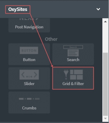
To add a grid & filter element from the elements panel go to OxySites ➟ Grid & Filter.
Example Standalone Grid
When the element is used standalone, the only thing needed is a "grid container" within the Grid & Filter element.
Acceptable “grid containers” include:
Repeater element
Oxygen WooCommerce Products List element
A custom grid container, e.g. a Div element
When using a "Repeater" or "Products List" element as grid container, nothing else is needed and the element will automatically figure out the grid elements. However, after changes are made in either the "Grid & Filter" options, or options of individual grid elements, it is advisable to click the "Apply Params" Button, to make sure no changes are missing in the preview.
In the following we will look at how to create a grid with a custom container.
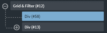
1.) Place a basic element, such as a Div element inside the Grid & Filter element. This element is used as the grid wrapper.
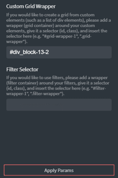
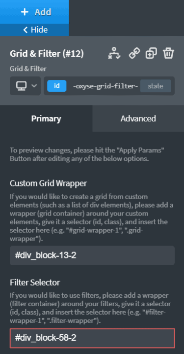
2.) Enter the wrapper’s selector in the Custom Grid Wrapper field. You can use the default ID or give the wrapper any other valid selector, such as .grid-wrapper.
3.) Place content into the grid as you wish. Make sure that the general layout of the custom grid meets the following requirement.
The item elements must not have any CSS transitions or animations applied to them, because they might conflict with the grid's internal animation engine.
You can control the gaps between the items by giving some margin to the item elements.
4.) Hit the Apply Params button to preview the changes.
Example Grid & Filter
As Grid & Filter works by using matching pairs of data attributes and because Products List items do not support data attributes, the products list cannot be used with a filter for now. If a filterable products list is needed, please use a Repeater element instead.
In the following we have a look at how to add a filter to the already existing grid from the example above.
1.) To create a custom grid, follow the steps 1. – 4. outlined in Example Standalone Grid above.
2.) Add an additional container Div element on the first level below the Grid & Filter element. This will be our filter container element. You can place the element before or after the grid container element.
It is possible to use a dynamic element such as a Repeater element as a filter container.
3.) Enter the wrapper’s selector in the Filter Selector field. You can use the default ID or give the wrapper any other valid selector, such as .filter-wrapper.
4.) Place your filter items inside the filter container. You can use basically any element you like, as long as you can add attributes to it. For the sake of this demonstration, we use 3 text links.
5.) For the filter to work you now simply have to give each filter item and their corresponding grid items the same attributes. The attribute must be called data-grid-filter. The attribute value of a filter item must correspond with the attribute value of the grid item you would want to filter out. The filter works by using AND connections. You can add multiple attribute values at once, separated by , (comma). Therefore, for the grid item to show up when the corresponding filter item is clicked, all attribute values of the filter item must be present in the attribute values of the grid item. The following truth table illustrates the behavior.
Filter Item Attr. Value(s)
A
Grid Item Attr. Value(s)
A
Grid Item Shown
YES
Filter Item Attr. Value(s)
B
Grid Item Attr. Value(s)
A
Grit Item Shown
NO
Filter Item Attr. Value(s)
A, B
Grid Item Attr. Value(s)
A
Grit Item Shown
NO
Filter Item Attr. Value(s)
A, B
Grid Item Attr. Value(s)
A, B
Grit Item Shown
YES
Filter Item Attr. Value(s)
A
Grid Item Attr. Value(s)
A, B
Grit Item Shown
YES
6.) Hit the Apply Params button to preview the changes.